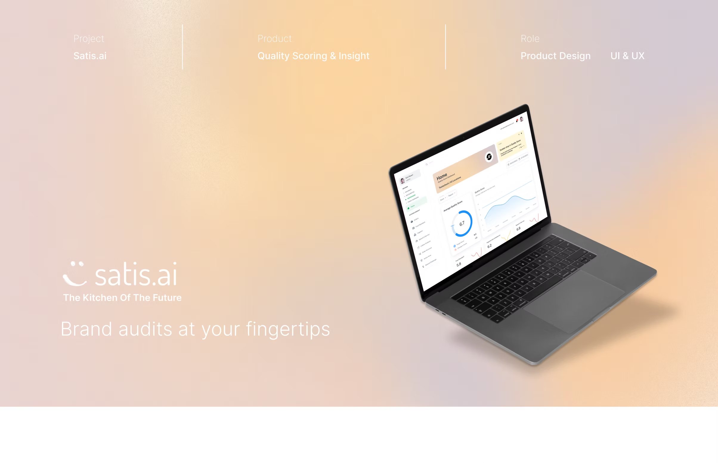
Fig. 01 — Brand audits at your fingertips. SATIS.AI Quality Score · 2022–2023.
Recreated · representative product visuals
How do you turn a constant stream of AI signal into a single number — one that a regional manager, a franchise owner and a corporate exec can each act on, at three different latencies?
A real-time, AI-powered scorecard that compares back-of-house performance across an entire restaurant estate — without anyone having to visit a single kitchen.
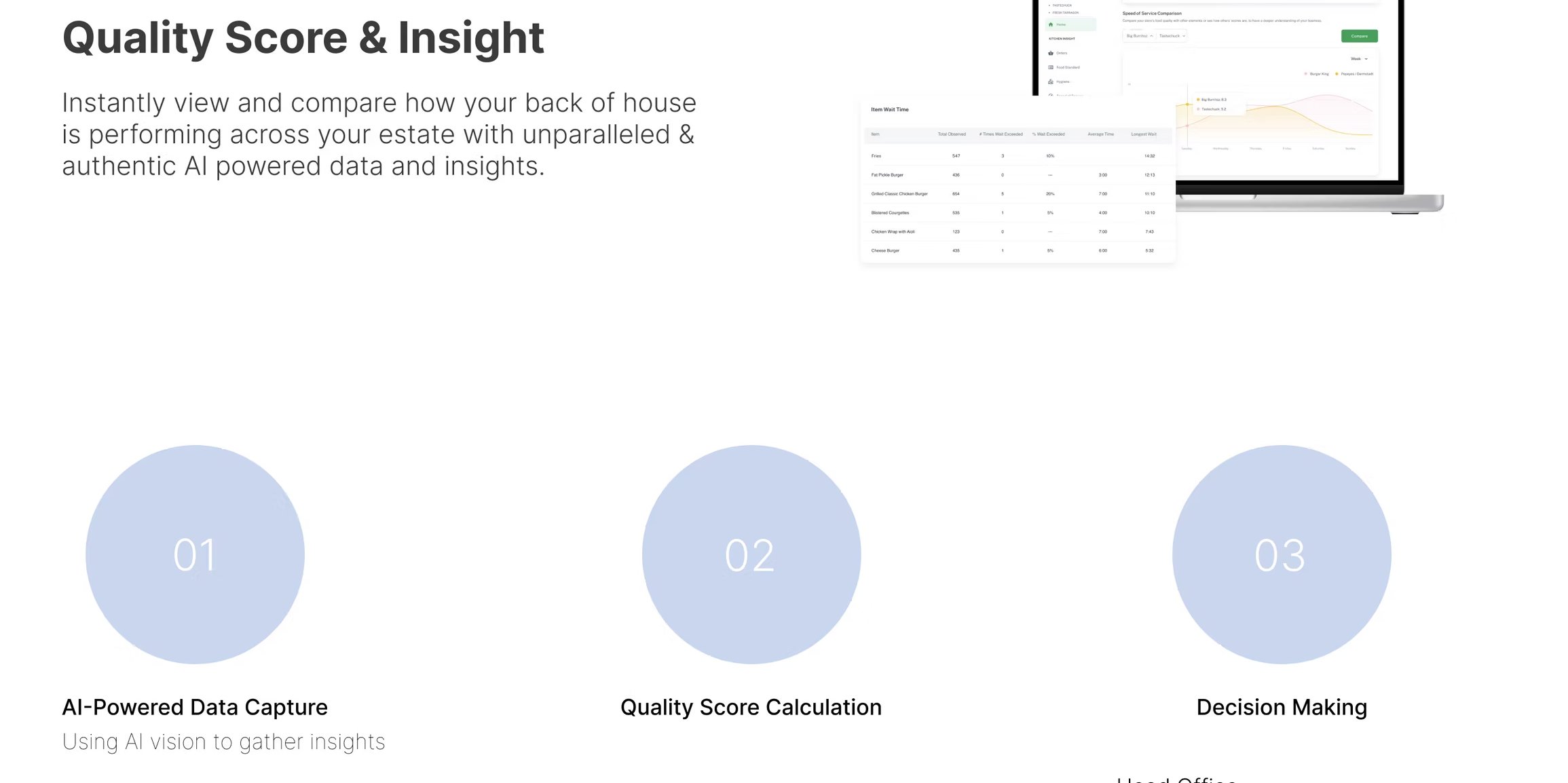
Instantly view and compare how each back-of-house is performing, with unparalleled, authentic AI-powered data and insights.
By 2022 the SATIS.AI camera and inference stack was producing tens of millions of events a week across multiple kitchens. The Packing Order Accuracy work (case study 01) made that signal useful to the crew on the line.
This case study is about the other direction: rolling that signal up. Turning hours of streaming inference into a single Quality Score per store, comparable across a network of franchises — readable in three seconds.
Quality Score had to serve three audiences who almost never see the same screen in real life. A regional manager living in a day, a franchise owner living in a week, a corporate exec living in a quarter. Each of them wanted “the score” — and each of them meant something completely different by that.
Lives in a day. Manages 4–8 stores in close proximity. Wants to know what to fix this shift.
1–3 stores, eyes on margin. Wants to know how each store is trending and where the gap is.
Group-wide. Wants to know whether the system is working — and which brands and regions are pulling their weight.
Three pillars hold the product up: AI-powered data capture (the camera and inference stack), Quality Score calculation (the rollup logic) and Decision Making (the surface that turns the score back into a decision a person can sign off on).
The hardest design problem sits in the middle pillar — it's where probabilistic events become a deterministic-looking number. Every design decision in this case study lives in that translation.
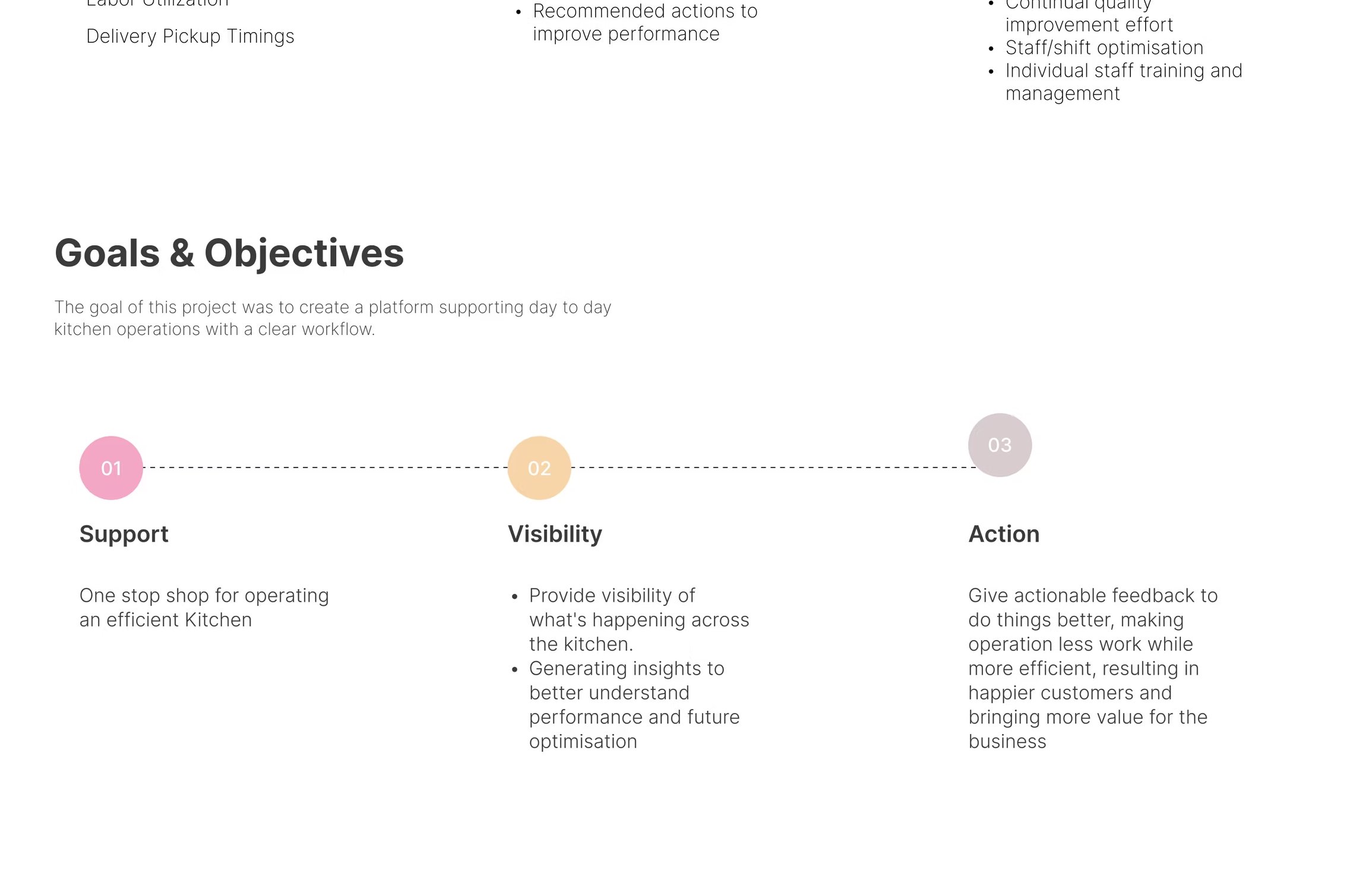
The product goal split into three: support the day-to-day of an efficient kitchen, give franchise owners visibility into what's happening across their stores, and make sure that visibility translates into action — not just dashboards.
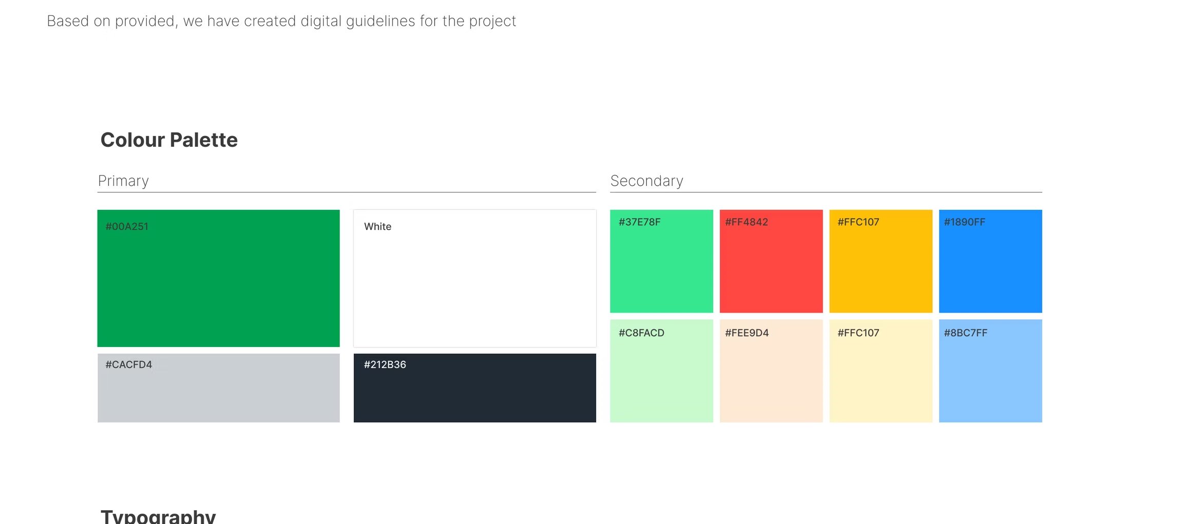
The visual system stayed restrained on purpose. A primary SATIS green for affirmative state and a small secondary palette of category colours for state/severity. Public Sans for type, set tight at headline weights, looser at data densities.
Numbers had to do most of the talking. Anywhere a colour appeared, it had to mean something.
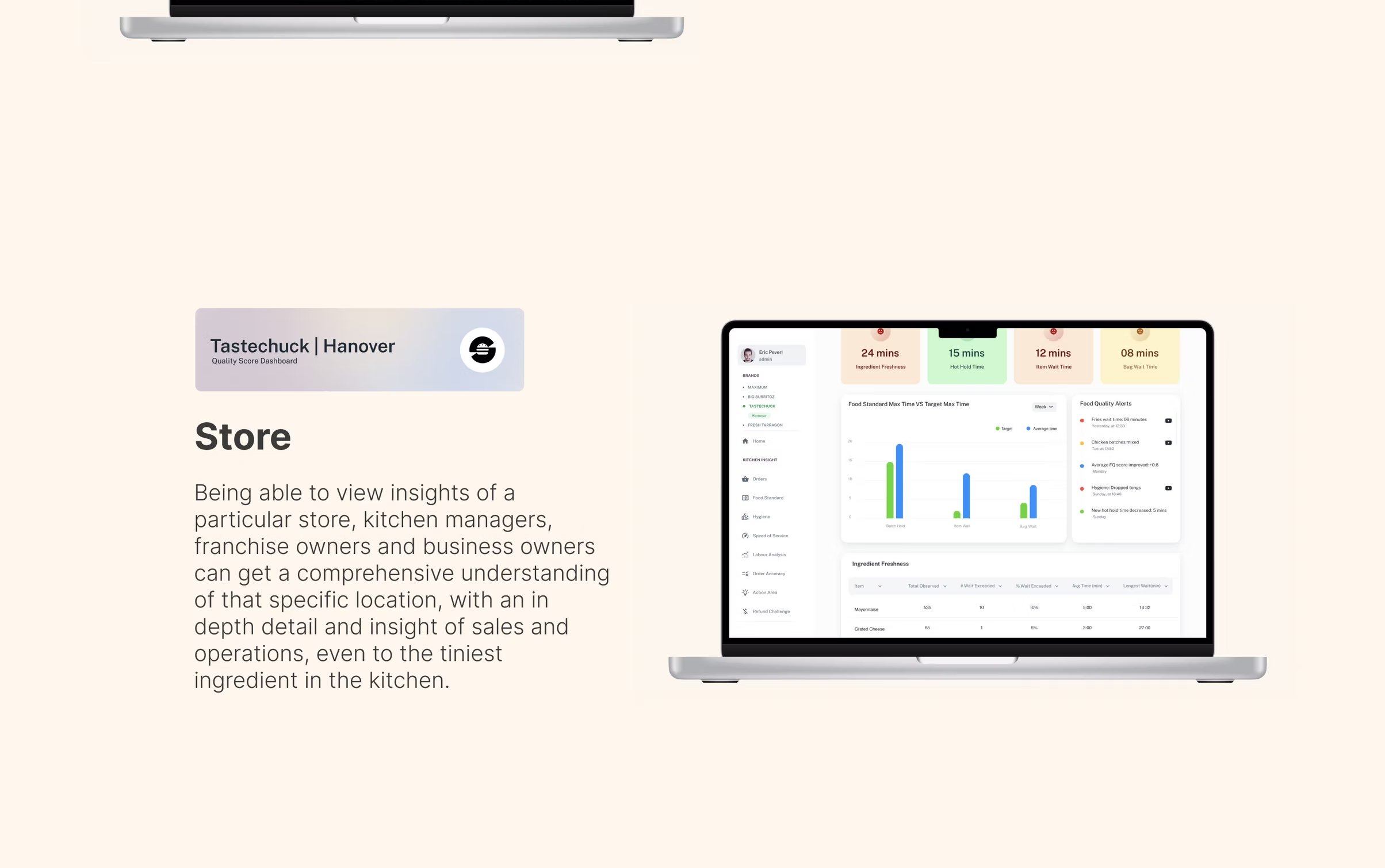
Quality Score lives at three resolutions. The Global view rolls every brand and every store into a comparable trend. The Brand view drops one level — comparing stores within a brand on the same axes. The Store view drops the final level — what happened on the line today, why the score is what it is, and what to fix.
Every view shows the same score in the same place — so people who travel between roles never lose their footing.
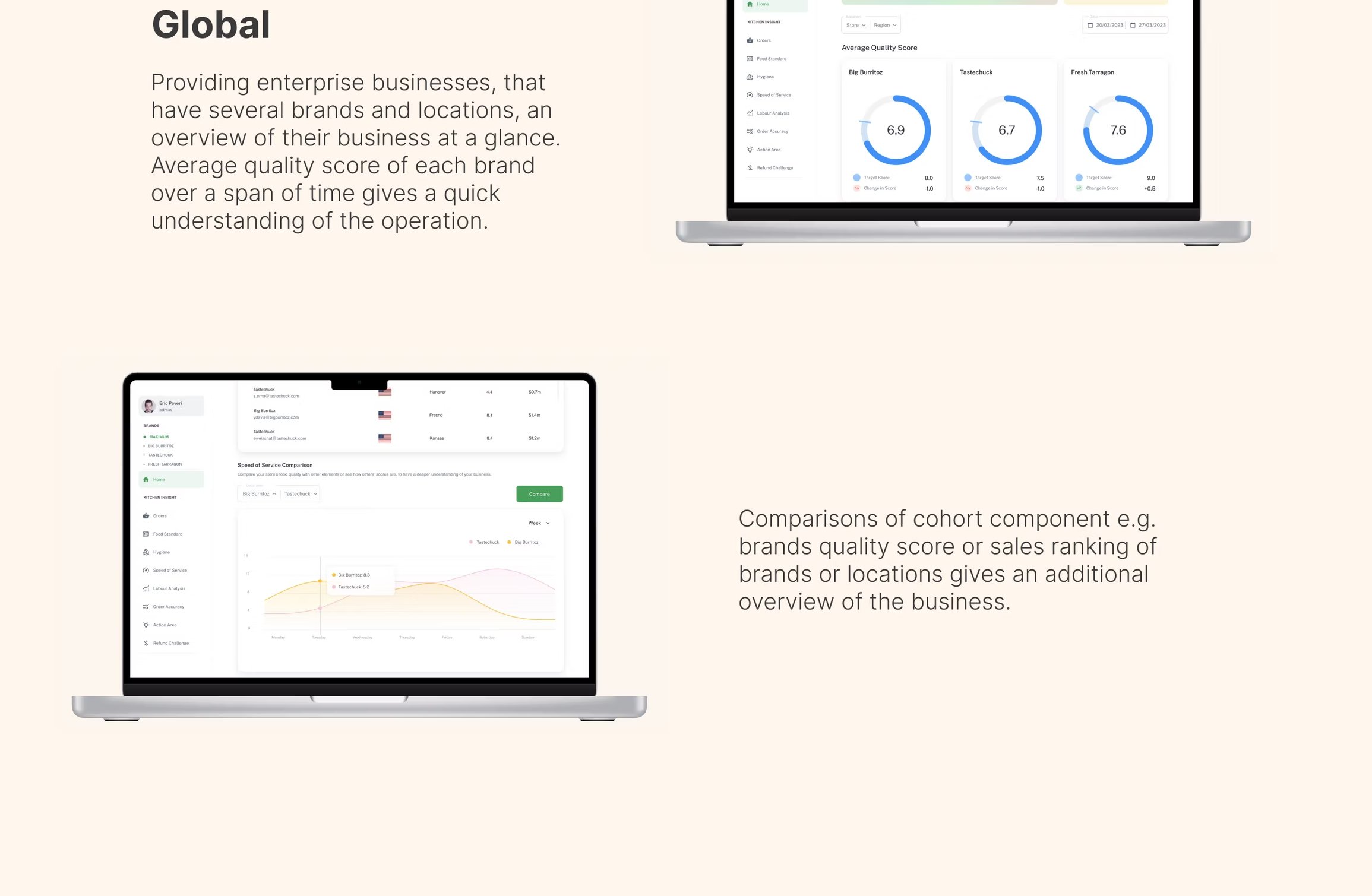
An overview of every business at a glance. Average quality score across each brand — one place that holds the operation in your head.
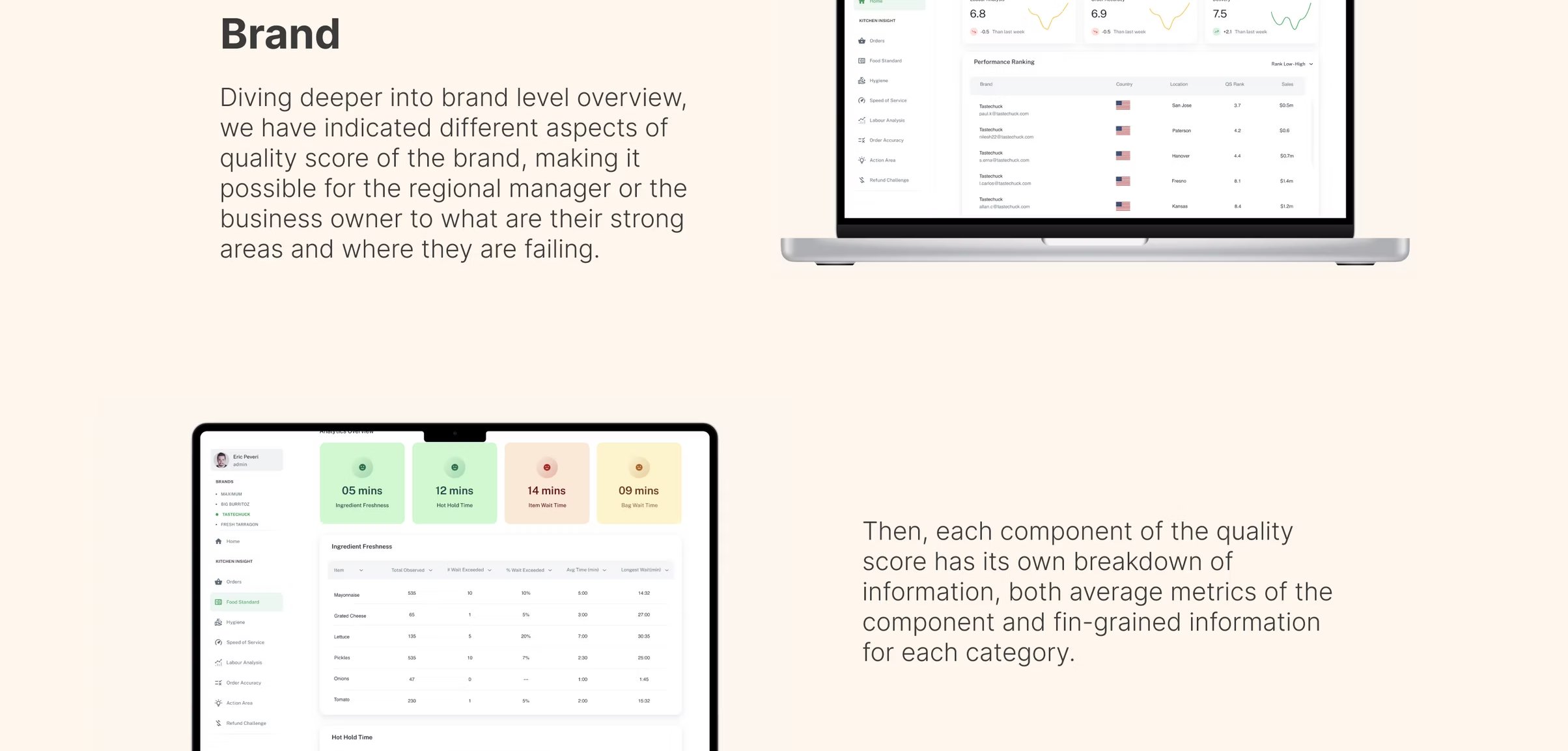
Diving into one brand-level overview — comparing different aspects of quality score, mapping it possible for the regional manager or the business owner to see where they're falling.
The deepest insight: a particular store. Kitchen managers, franchise owners and business owners can get a comprehensive understanding of that specific location, with an in-depth review and insight of cases and operations, even to the tiniest ingredient in the kitchen.
The same number sits in the same place at every level. Drill-down never disorients — the headline doesn't move.
Every chart, every view, every report. Comparison happens on time first, and on category second.
Stores compare to their cohort, not to global. A small franchise isn't graded against a flagship.
Every score is one click away from the events that produced it. No black-box scoring.
Good is calm. Bad is colourful. The dashboard is almost monochrome on a healthy day.
Every insight surface ends with one specific next move. Visibility without action is what we were replacing.
By 2023 Quality Score had been adopted across multiple operators in both UK and US, and was being used in pre-shift meetings, franchise QBRs and corporate board decks — the same number, in three different rooms.
The product became the spine of the SATIS.AI commercial story — not because of the model, but because a corporate exec could finally see what a regional manager had been telling them for years.
Most of the work was deciding what the score looks like, not how it's computed. The model was the easy part. The score was the hard one.
For a multi-role product, never make people search for the right level. Start every persona at their level — and let drill replace navigation.
A daily score is real-time for a regional manager. A weekly score is real-time for a corporate. Designing latency is more important than designing the chart.
Every dashboard surface ends with one explicit next move. Otherwise you've built a thing people scroll, not a thing people use.