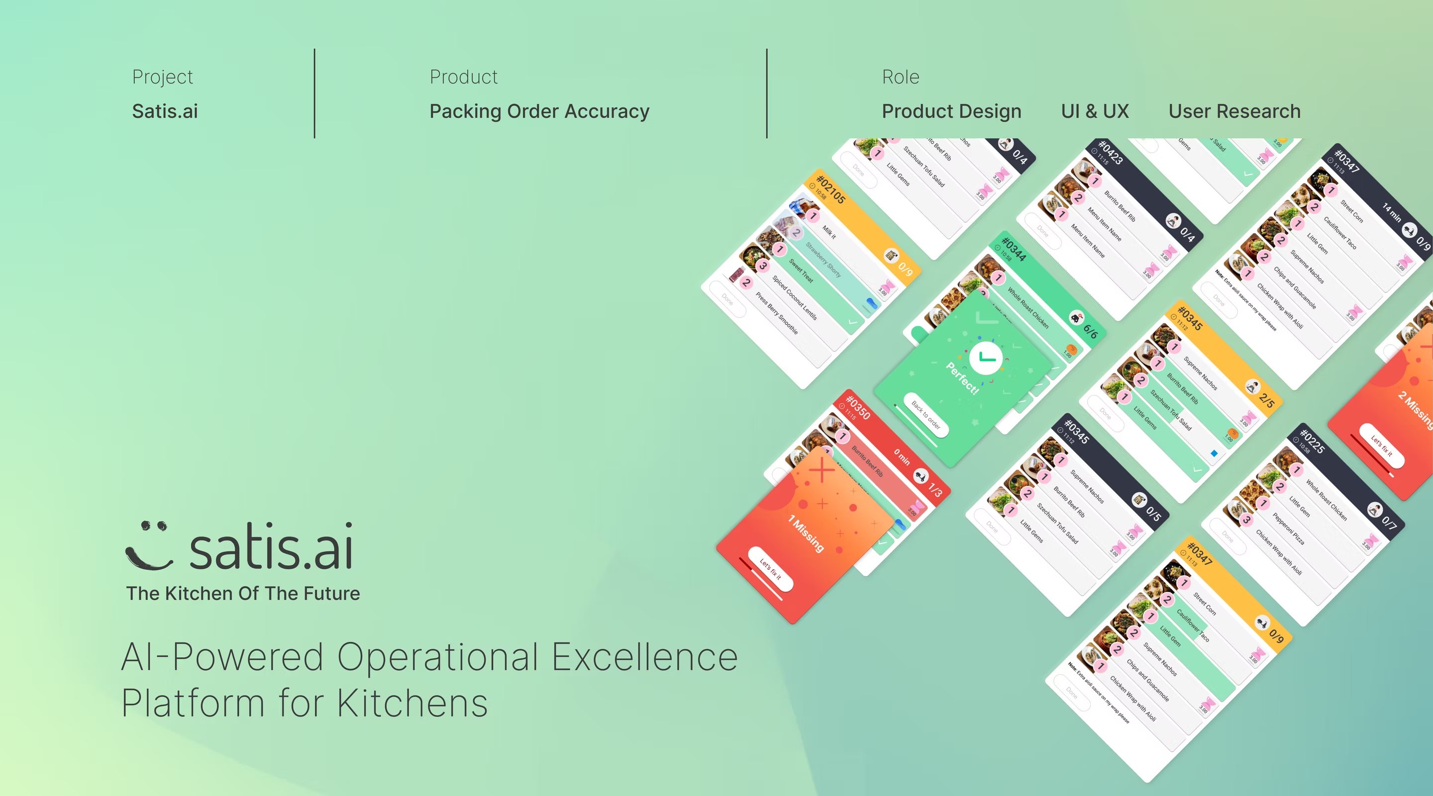
Fig. 01 — Packing Order Accuracy, AI-powered operational excellence platform.
SATIS.AI · 2020–2023
How do you design an AI interface for fast-food workers under pressure, in a physical environment the AI can only partially perceive — and which, mostly, they didn't ask for?
The SATIS.AI Kitchen Intelligence Platform identifies issues via cameras and communicates them to staff through interactive screens, in real time. Packing Order Accuracy is the AI assistant for the packing station — reducing packing time while increasing accuracy by guiding employees step-by-step through the process.
SATIS.AI builds an operational platform for quick-service restaurant kitchens. A network of cameras runs continuous inference over what's happening at the counter, the frier, the prep line — turning unstructured physical activity into structured signals about timing, hygiene, food safety and staff workload.
That signal is only useful if a 19-year-old crew member, four hours into a lunch peak, with grease on their hands and a queue out the door, can act on it in under three seconds — and trust that acting won't embarrass them.
I joined as the second hire on a team of engineers and computer-vision researchers. I was the only person on the team with a design background. Everything you see in this case study — from station UI to manager dashboard to the brand — was designed end-to-end, in three years, often a few hours ahead of installation in a real kitchen in London or Atlanta.
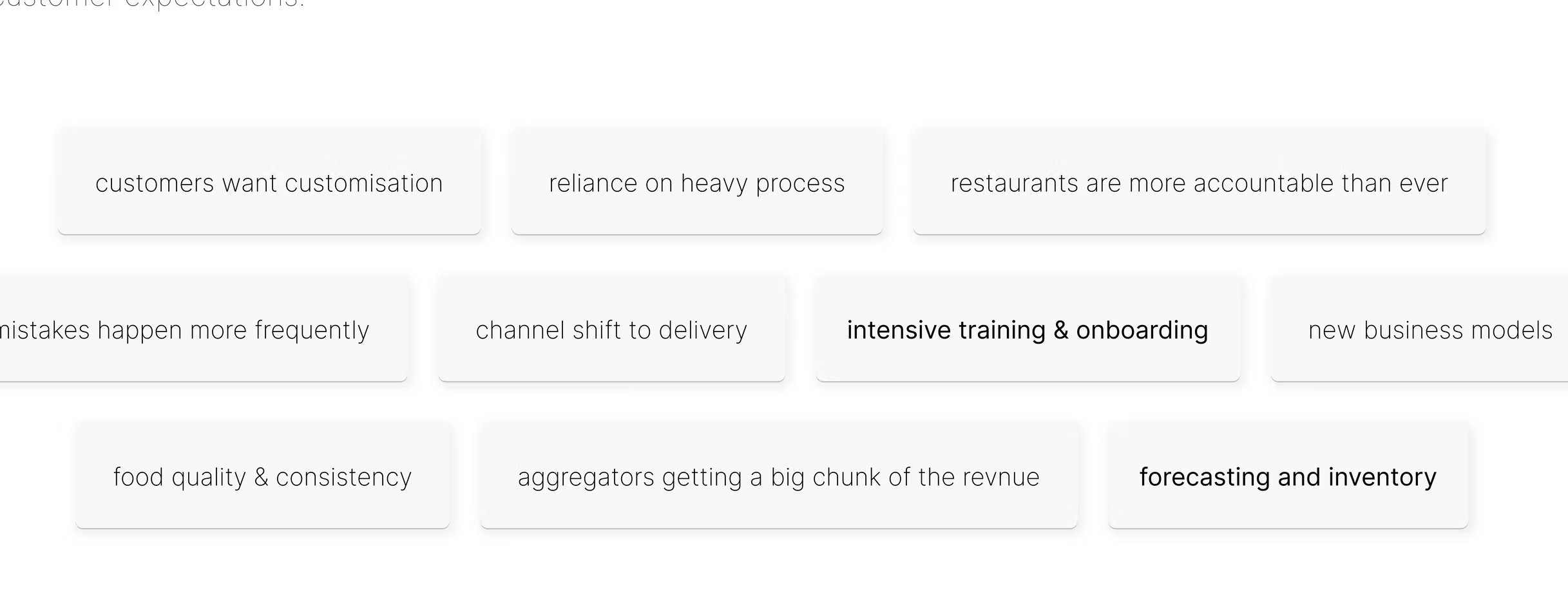
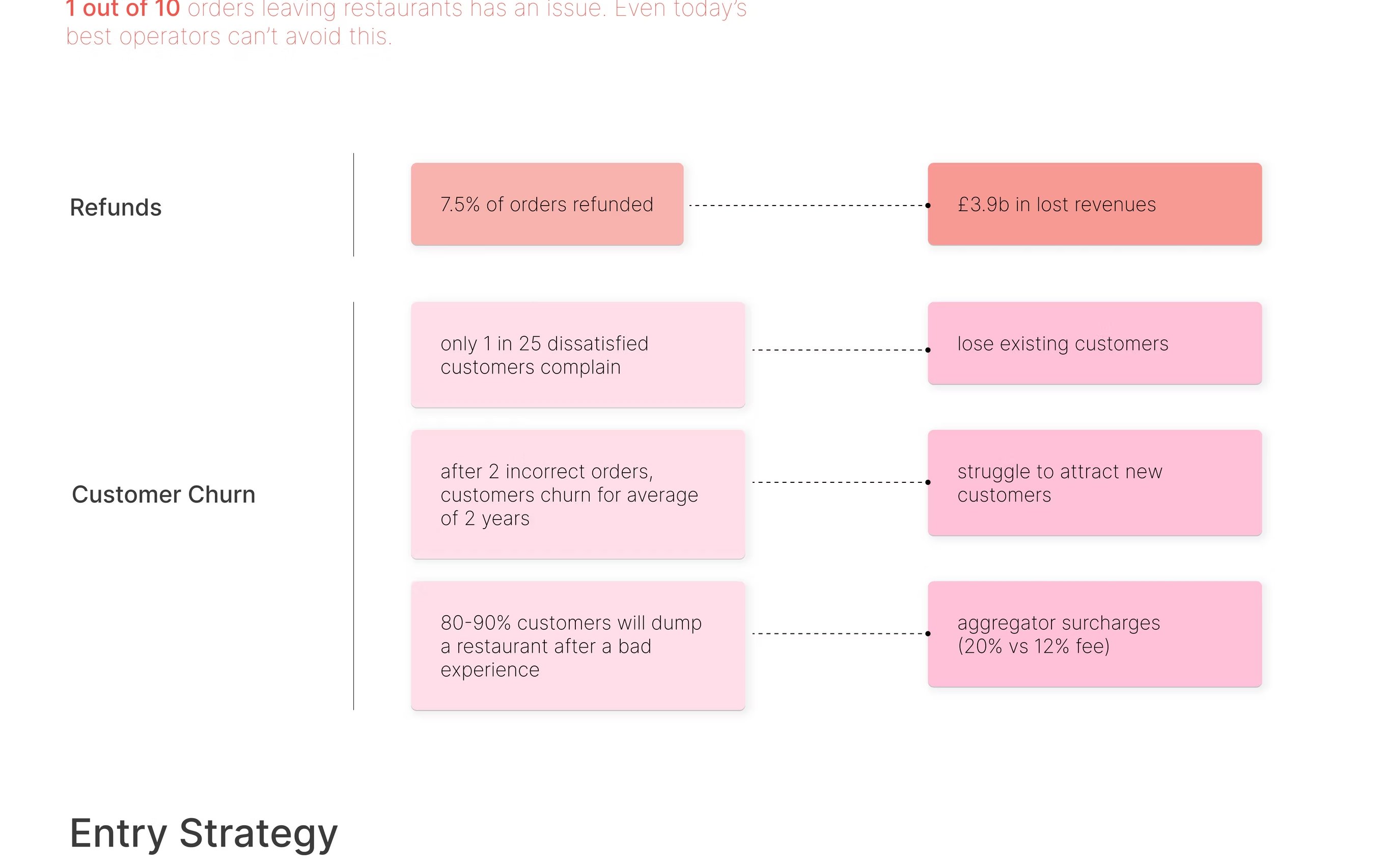
The food industry is still running on a 1960s playbook, in an era of customisation, delivery aggregation and brutal customer expectations. The discovery phase mapped where the new pressures land hardest: mistakes are costing kitchens. Roughly 1 in 10 orders leaving a restaurant has an issue — even today's best operators can't avoid this.
We framed the problem — refunds, churn, aggregator fees — before we framed the product. Then we picked the smallest, sharpest wedge: packing.
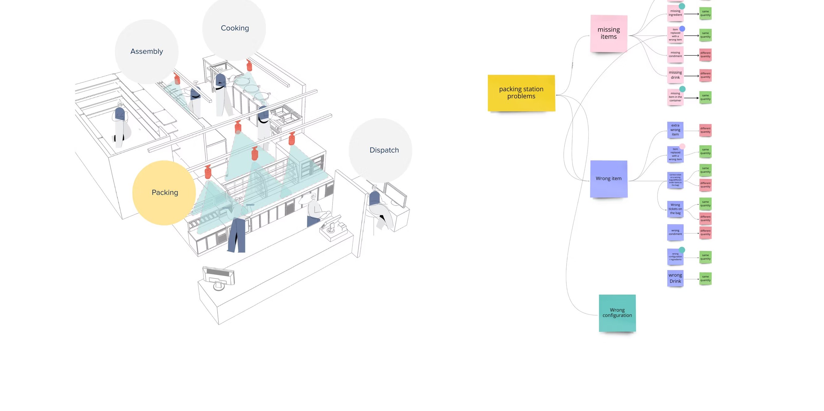

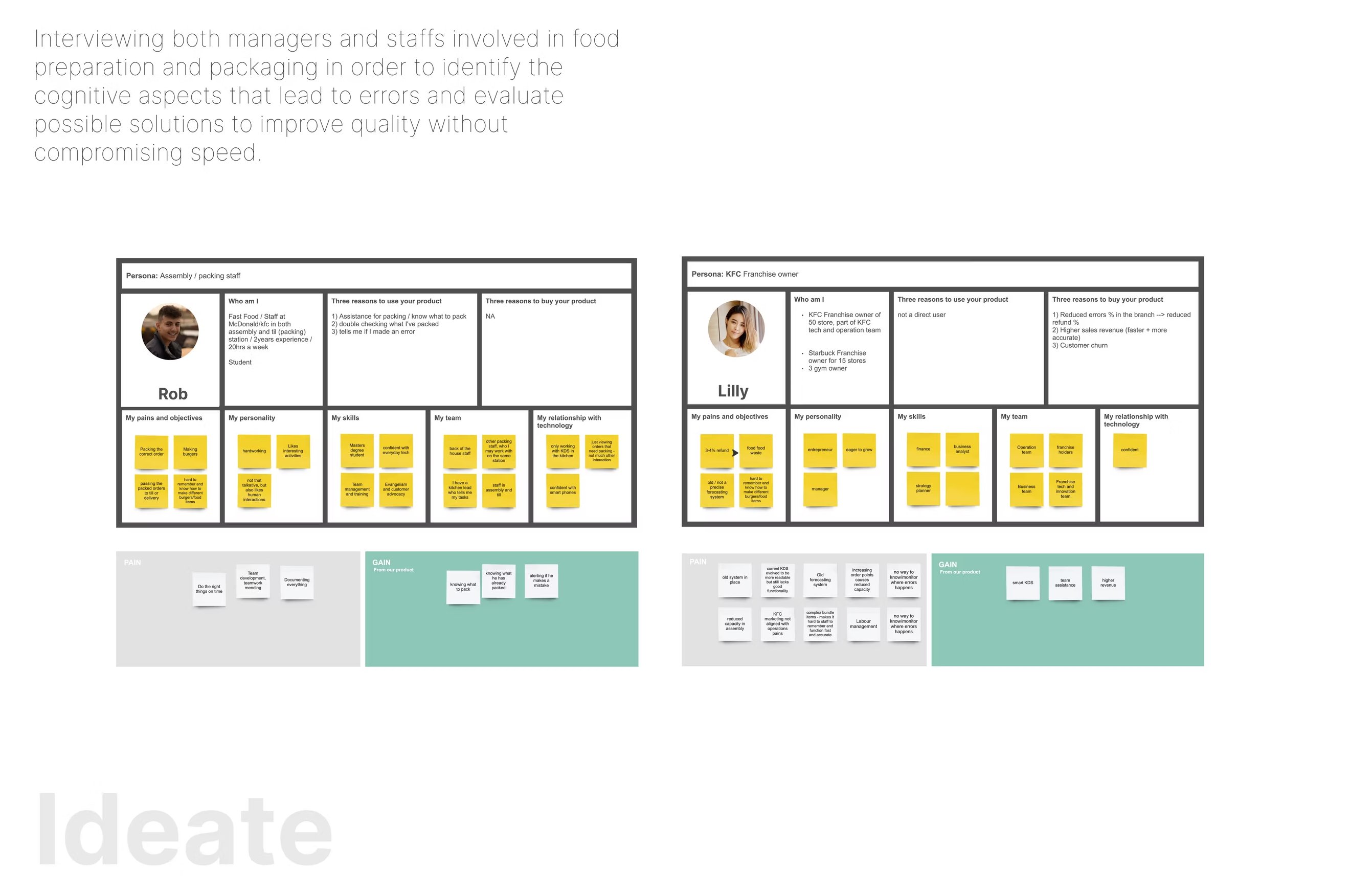
We interviewed managers and staff to find the cognitive aspects that led to errors. The output was a sticky-note matrix per persona — tasks on one axis, friction on the other — that fed directly into the information architecture of the product.
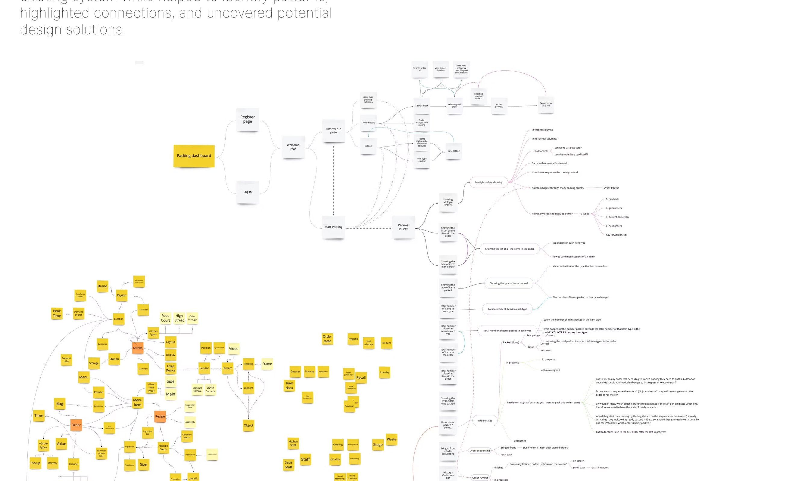
From there, a single mind map: every component, feature and function of the existing system, laid out in one wall, so we could see where to add the AI without breaking what already worked.
Most AI design writing assumes a clean office user with time, screen real estate and patience for a tooltip. That user does not exist here. Here we have a person with seconds, no spare hand, and a real-world consequence for getting it wrong — pairing with a model that has its own gaps in perception.
The job of the design wasn't to solve either problem in isolation. It was to design the conversation between them.
User-friendly interfaces dealing with intricate features, multiple functionalities, and vast amounts of information.
User-friendly interfaces dealing with intricate features, multiple functionalities, and vast amounts of information, in a fast-paced environment that should have minimum amount of interactions.
Interactions should minimise cognitive load, avoiding overwhelming users with excessive information or complex tasks. Striking the right balance between providing necessary information and preventing information overload is crucial for a positive user experience.
AI should provide clear feedback to users, ensuring that users understand the status, progress, and outcomes of their interactions. Establishing effective communication channels is vital for building trust and enhancing user satisfaction.
Designing systems that can handle and recover from human errors is essential. AI should be able to detect errors, provide appropriate feedback, and guide users towards recovery options to minimise frustration and mitigate potential risks.
Human-machine interaction raises ethical questions, such as privacy, data security, and automation's impact on employment. We addressed these concerns ensuring that design is aligned with ethical principles, societal values, and legal regulations.
We mapped the operational day as three nested loops — not three separate products. The station crew lives in seconds. The manager lives in shifts. The regional operator lives in weeks. Every signal the model produced had to travel through all three with the right amount of context dropped or added at each layer.
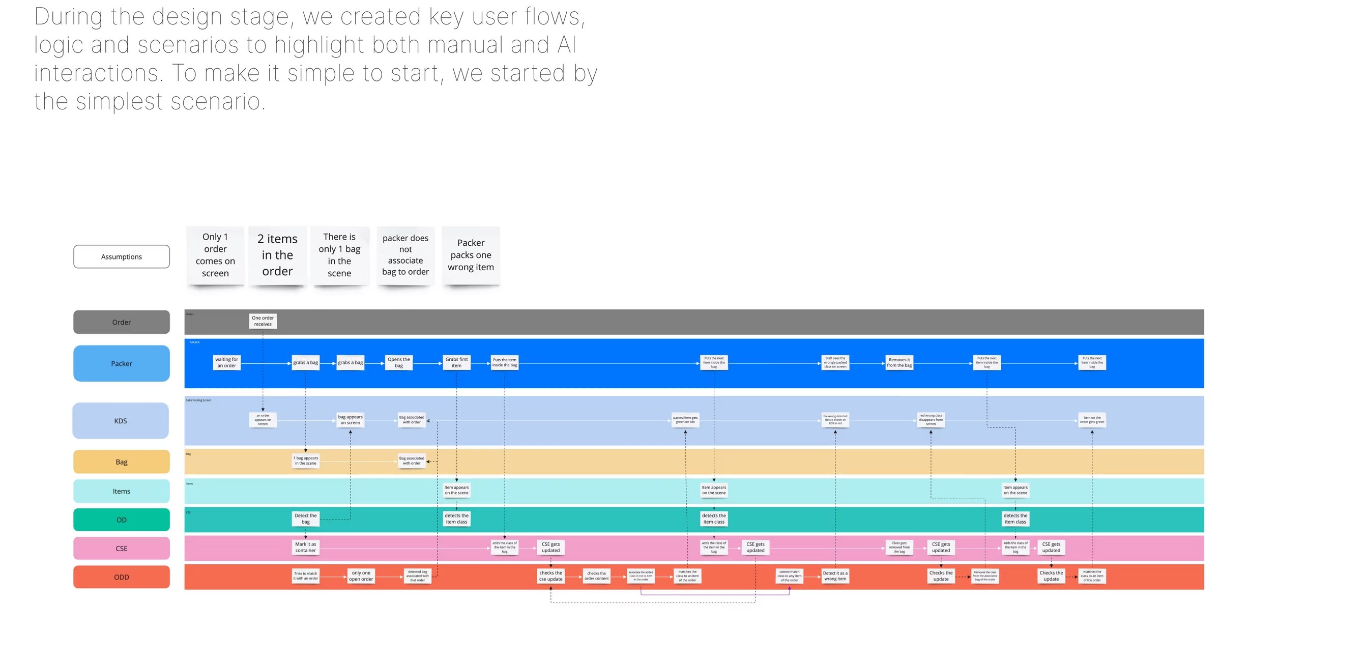
Below: the loop the station crew lives in — where humans and AI most directly meet — followed by a visual user-flow over the packing station's entire lifecycle.
CV pipeline observes the line. Continuous inference at ~7 fps.
Event scored against confidence, history and shift context.
Glanceable card. Confidence visible. Source visible. Never an order.
Crew confirms, dismisses or ignores. One tap. Two seconds.
Outcome feeds the manager loop and the confidence model.
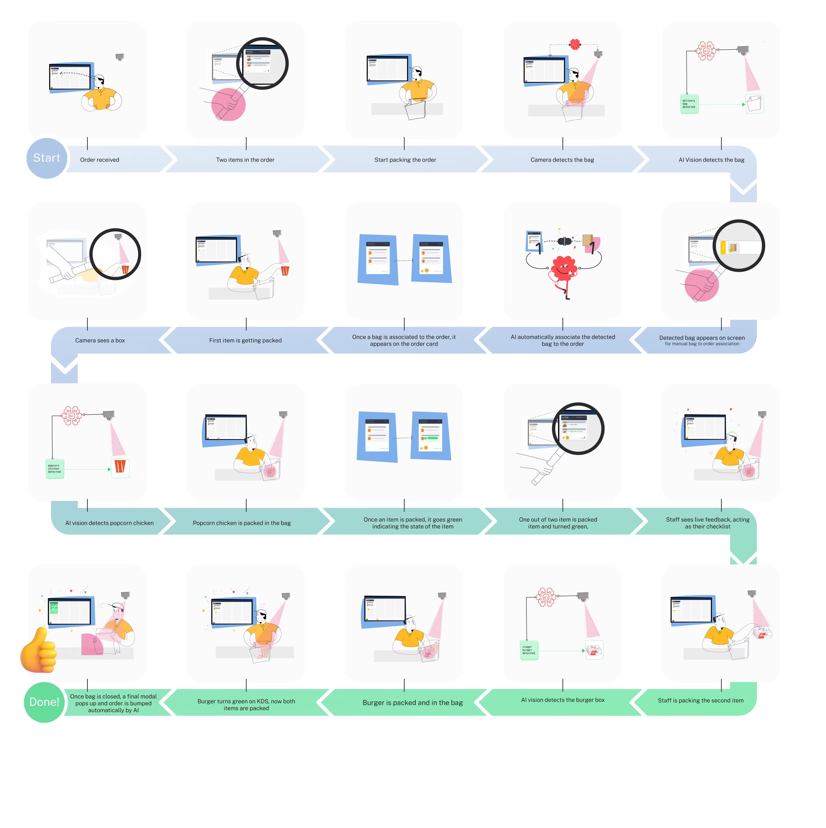
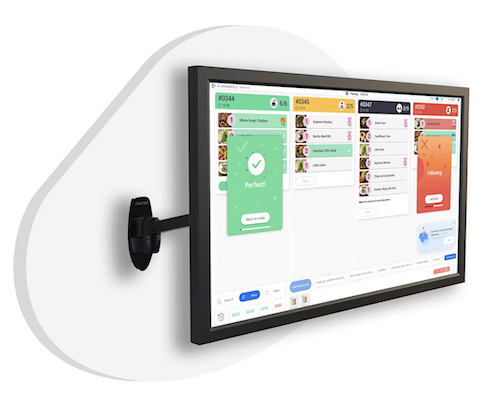
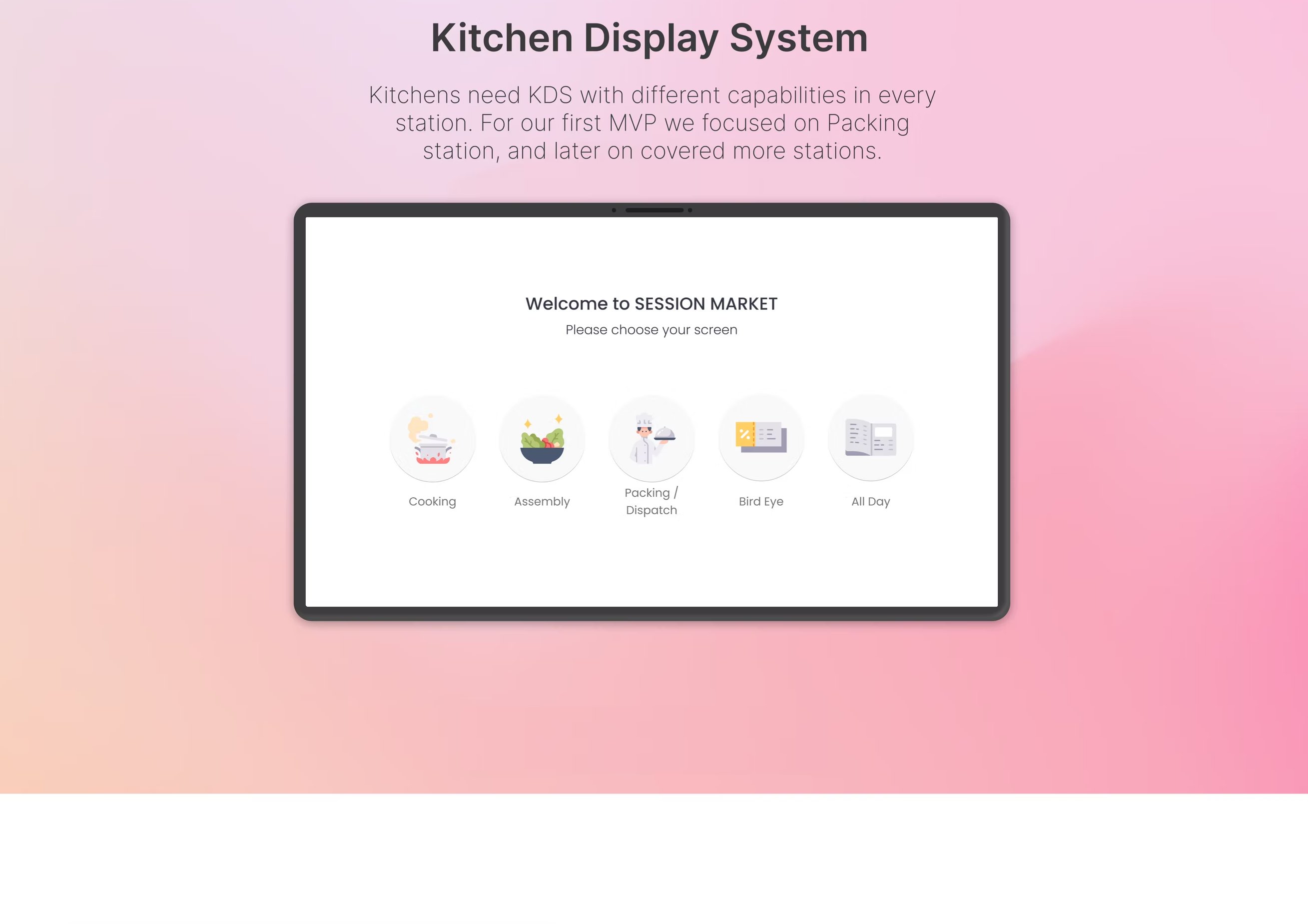
The Kitchen Display System is the spine of the product. It opens with a station selector — Cooking, Assembly, Packing, Bird-Eye, All-Day — so the same hardware adapts to the crew member who walks up to it. Packing was the MVP.
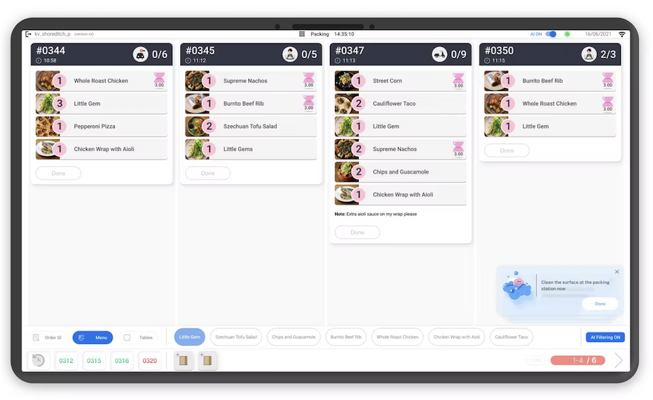
To reduce cognitive load we limited the number of displayed orders to four at a time, instead of the traditional twenty. Everything you see next — the order card, its five states, the icon set — is built on top of that single decision.
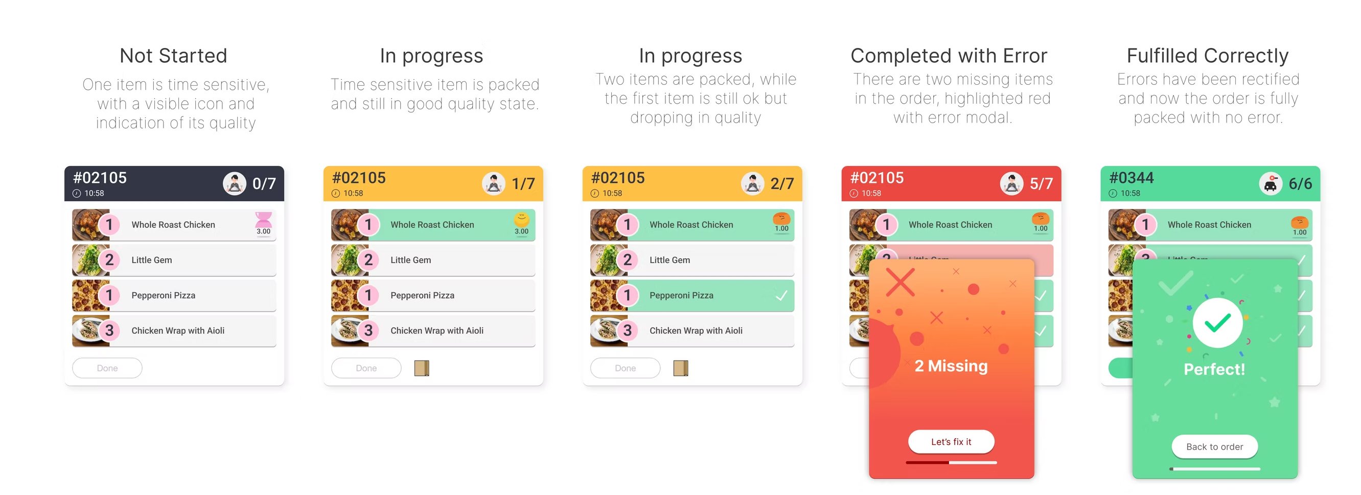
Every prompt is phrased as “Looks like…” with a clear way to dismiss. The model is offering its view, not issuing orders.
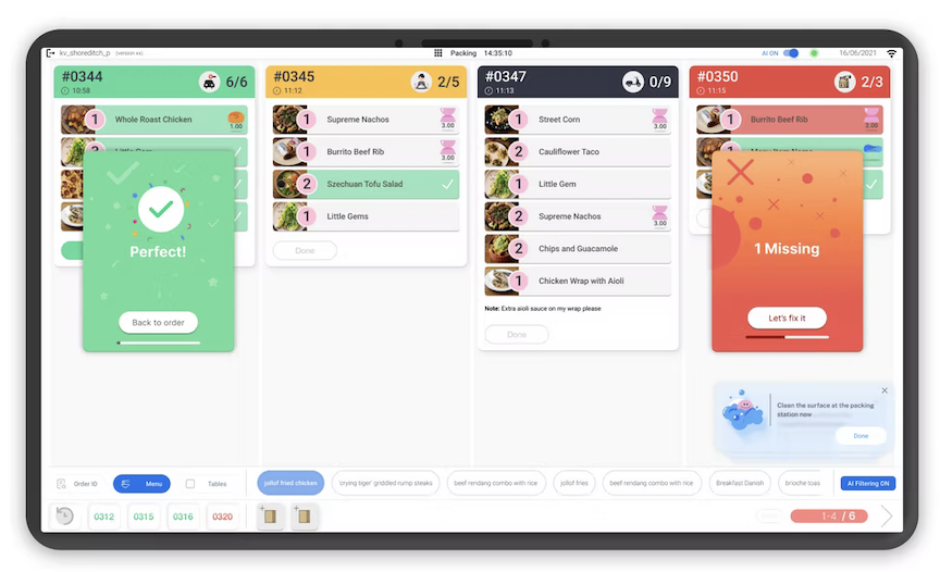
Card color & header copy carry status. Crew read state at three metres — same speed as reading a traffic light.
A missing-item alert is a modal, not a notification — staff has to acknowledge before the order can advance.
Never more than four orders on screen. Older orders get bumped off; "All-Day" view is for the manager, not the line.
A dismissal is never a dead-end — it enters the manager loop as a tuning signal and tunes confidence per station.
No sounds, no flashes. Visual priority shifts within the screen. A kitchen has enough noise without us adding to it.
I designed a custom icon pack covering every category and capability on the KDS — item quality, nudges, order channels, station-selection. The brief was clarity at three metres, recognition under one second, no fine detail, no jargon.
Friendly characters showed up where the system needed warmth (nudges, fresh items). Flatter, more functional symbols showed up where the system needed authority (order channels, station selection).

By 2023 the platform was live across both UK and US sites, with multiple operators. The work I'm most proud of isn't any single screen — it's how the patterns above changed the shape of the conversations the company was able to have with operators, investors and crews.
I also led design of the manager dashboard, the regional operator view, and contributed to the SATIS.AI design system, brand and investment materials — effectively running the design function single-handed for two and a half years.
Confidence bands, source-frame reveals, dismiss-as-data — these tiny patterns moved more trust than any marketing copy ever could. The interface is the trust layer.
Pretending the model is confident when it isn't costs you the user. Pretending it can see everything when it can't costs you the operator. Legibility is the only honest move.
The crew, the manager and the operator live in different time-scales. Designing for that hierarchy — rather than for one universal “dashboard” — let the same model serve three audiences.
The hardest UX problem in applied AI isn't novelty — it's consent. When users didn't pick the tool, every interaction is a re-pitch. Quietness, dignity and usefulness are the reply.