EditionField notes · Vol. 01
PracticeData-driven
visualisation
Span2018 — present
SurfacesPrint, decks, product UI, identity

Infographics.

Diverse infographic projects, crafting impactful visual narratives that simplify complex information and captivate audiences.

From data-driven visualisations to storytelling-driven illustration. Each piece in this collection is a careful blend of creativity and strategic thinking, combining compelling design elements with a keen focus on clarity and user experience.

These projects are an adjacent practice to the product design work — and arguably the discipline that shaped it. Most of what I do as a designer of AI products started here: in single drawings that have to explain an entire system to a stranger in fifteen seconds.

A row of seven circular data-visualisation glyphs, building up density left to right.
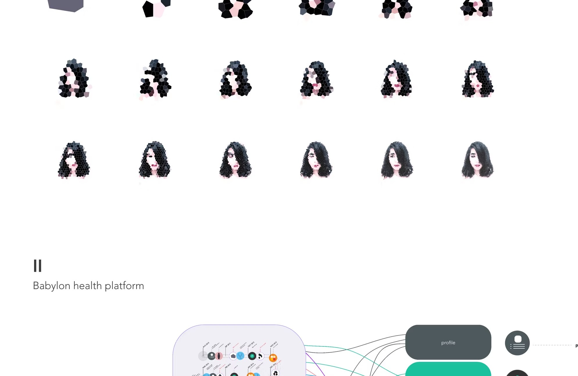
Fig. 00 — Micro graphs, an opening pattern Density, accruing left to right
01.
— Babylon Health Platform · 2018

A digital twin for state-of-health, made readable.

How do different facets of a health platform combine to form a comprehensive health record — simulating a state of health based on the user's interactions?
↳ Two-part graph. The user, and the system around them.

The graph shows how different facets of a Babylon health platform contribute to forming a comprehensive health record over time. Part I shows knowledge improvement through time, as the user's data profile grows in resolution. Part II shows the platform itself: profile, PGM, consultation, wearables, triage and digital twin streams feeding the same human.

The intent was simple: turn a probabilistic, multi-input AI system into a single piece of paper somebody could read in under a minute — without losing the part that makes it interesting.

A 3-row grid of stylised portrait sketches getting more detailed left to right, illustrating user-profile resolution improving over time.
Part I A user profile, getting more comprehensive through time.
18 frames · ~24 months
Babylon health platform diagram: timeline of interaction events feeds six data streams — profile, PGM, consultation, wearables, triage, digital twin — back to a single user.
Part II · Babylon health platform
Six streams, one person.
Profile · PGM · Consultation · Wearables · Triage · Digital twin
— Move 01

Treat the user as the node, not the audience.

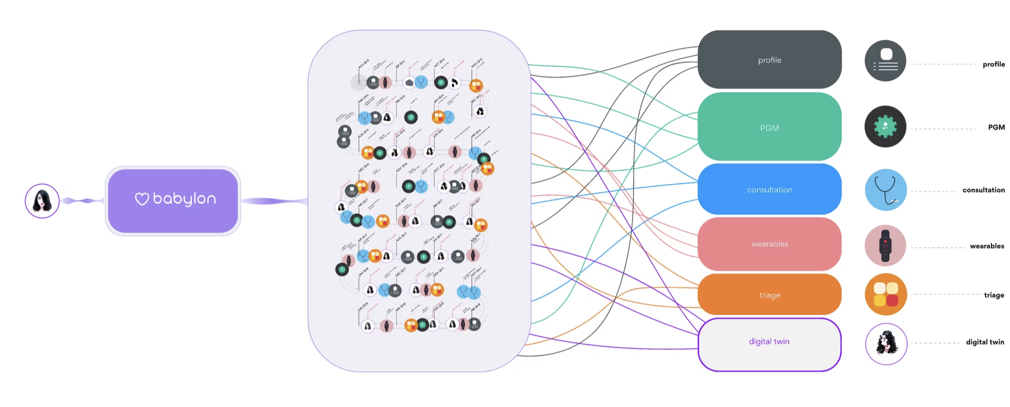
The human sits at the leftmost edge of the diagram — not at the top. Information flows back to them, not down at them.

— Move 02

Use time as the baseline axis.

The interaction timeline is the spine of the graph. Every data stream is a thread that touches it — not a separate diagram.

— Move 03

Resolution as storytelling device.

Earlier portraits are sparse; later ones are detailed. The graph shows the model getting smarter without us having to write that sentence.

02.
— Visual Recipe Cookbook · 2019

A visual vocabulary for the kitchen, drawn from scratch.

Cooking instructions, redrawn as a flow — so a recipe can be read at the speed a kitchen actually moves.
↳ The visual system that eventually informed the SATIS.AI icon pack.

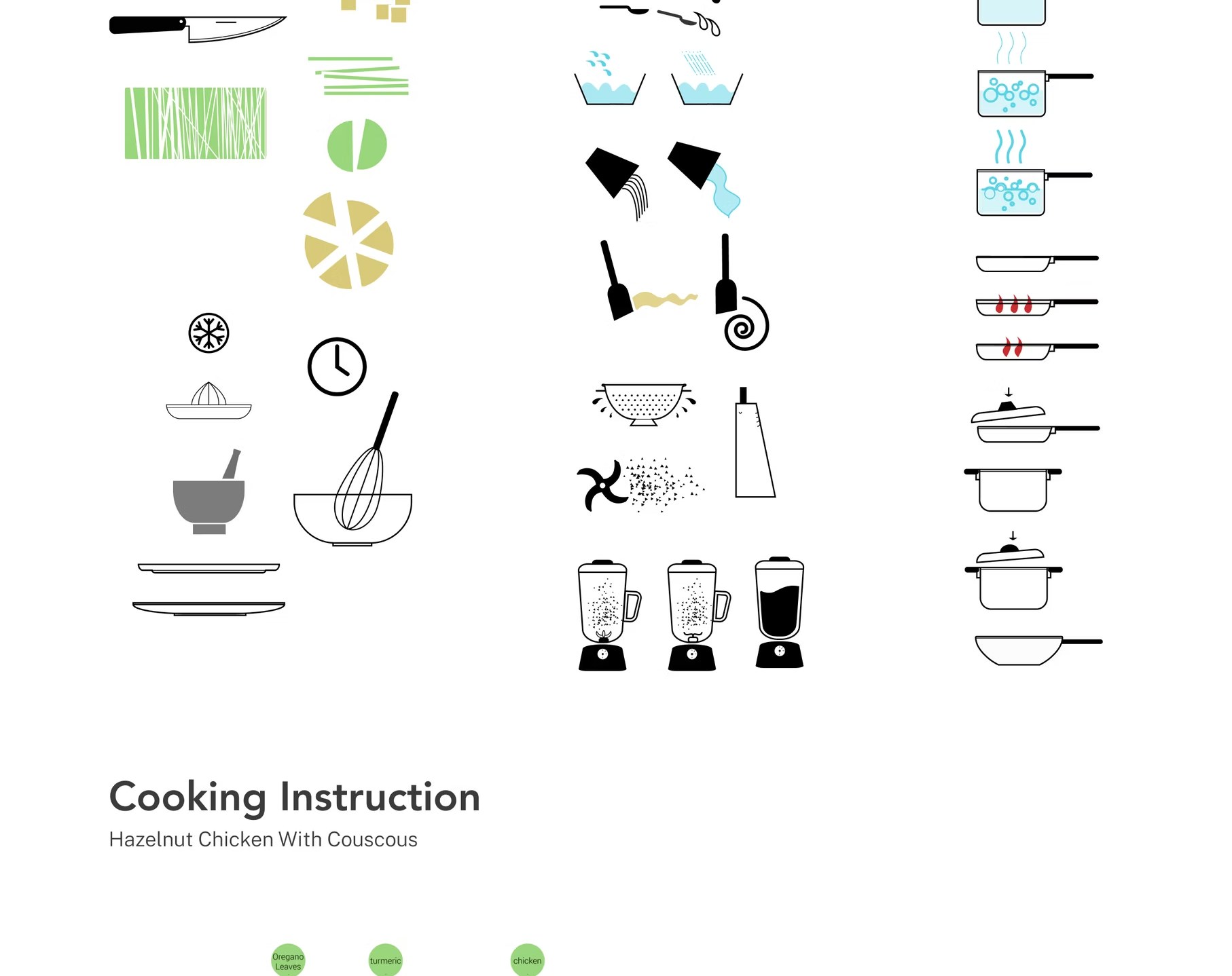
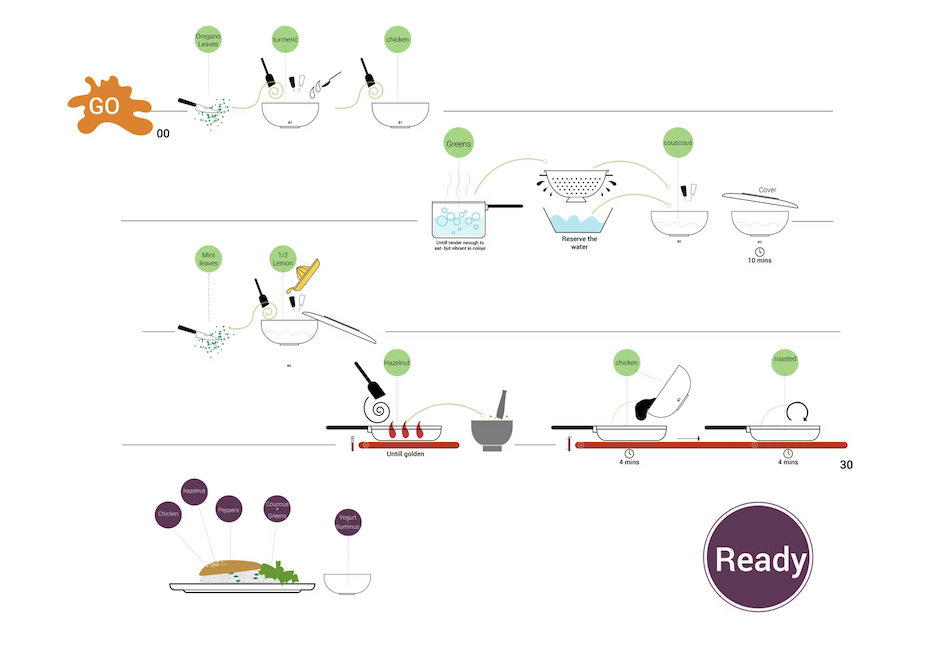
An experiment in turning recipes — long, language-heavy, ambiguous — into a single horizontal flow of icons, timings and ingredients. The visual vocabulary was designed in three families: preparation, technique and cooking, so any recipe could be assembled from a small kit of parts.

The icon set later seeded the design language of the SATIS.AI Kitchen Display System, where the same visual logic had to work for crew members on a working line.

Three columns of hand-drawn cooking icons: Preparation, Technique and Cooking.
kit of parts.
Preparation · Technique · Cooking
The full Hazelnut Chicken with Couscous visual recipe: four rows of left-to-right cooking steps, each step shown as ingredient drops, vessels and timings, anchored by a GO splat top-left and a Ready badge bottom-right. Final plating shows Chicken, Hazelnut, Peppers, Couscous & Greens, Yogurt & hummus on the plate.
Hazelnut chicken with couscous, drawn as a flow.
GO  →  READY · 4 rows · ~30 min
03.
— SATIS.AI Platform · 2022

A whole AI rollout, in three isometric rooms.

From installation to real-time feedback, in three simple steps — for an operator in a hurry.

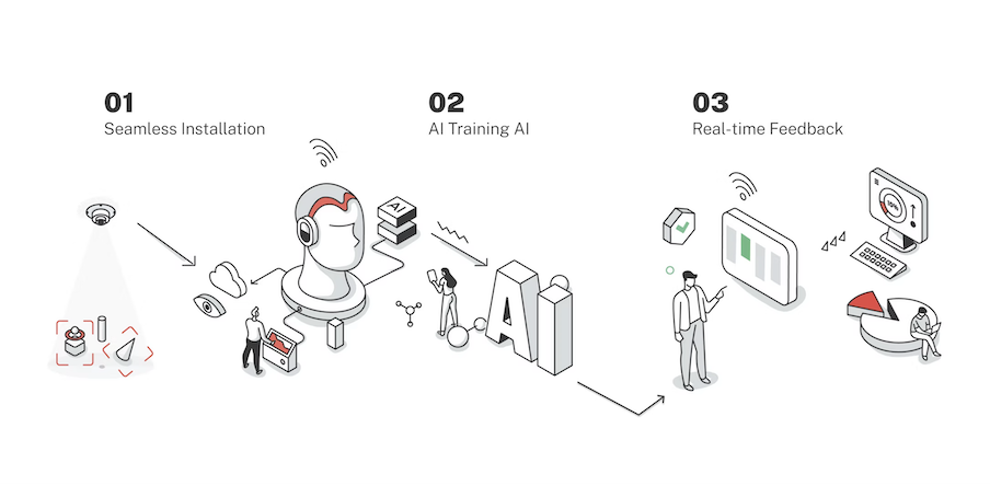
The first time SATIS.AI had to be pitched to a kitchen operator, the question wasn't “what does the product do” — it was “what will my Tuesday look like.” This three-panel isometric illustration sequences the answer: seamless installation, AI training, real-time feedback.

Used across investor decks, sales decks and the welcome screen of the first install — a single visual that had to scale from a CFO to a 19-year-old crew member on day one.

A line-illustrated three-step onboarding for SATIS.AI: 01 Seamless Installation (a sensor mounted to a ceiling, casting a detection cone onto a red object-detection frame); 02 AI Training AI (a human head wearing headphones connects to a giant ‘AI’ block, with a worker and a researcher beside it); 03 Real-time Feedback (a person tapping a tablet that flows into a dashboard, a pie chart and a monitor with green bars).
Install train learn from the line.
01 Seamless Installation · 02 AI Training AI · 03 Real-time Feedback
04.
— Reinventing Food Production · 2022

The $4T opportunity, drawn as a system.

Where machine-assisted food production reduces the lost opportunity between agricultural advancement and what reaches the consumer.
↳ Used to frame the broader category for new markets.

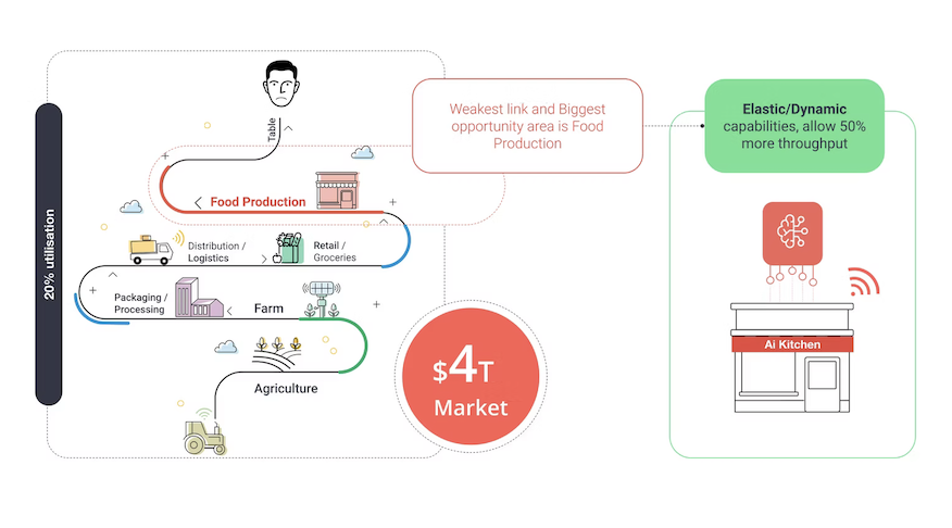
A category-level diagram that places SATIS.AI inside the wider picture: a multi-trillion-dollar global food market where most efficiency gains in agriculture never reach the plate. The drawing tracks the journey from farm to franchise, marks the leakage, and points at where machine-assisted operations close the gap.

A wave-graph infographic of the global food system. Six stages curl down from Table at the top through Food Production, Distribution / Logistics, Retail / Groceries, Packaging / Processing, Farm and Agriculture. A red callout marks Food Production as ‘the weakest link and biggest opportunity area’, sitting against 20% utilisation. A red $4T Market badge anchors the centre. On the right, a green-bordered AI Kitchen node shows ‘Elastic / Dynamic capabilities allowing 50% more throughput’ feeding back into the system.
Agriculture kitchen consumer.
$4T global market · the weakest link is the kitchen
— On the practice

Why a product designer keeps an illustration practice.

Half of designing for AI is making something probabilistic look like something a human can hold.

Infographics are a stress test for clarity. They force you to commit to a single way of explaining something to a stranger — no progressive disclosure, no rollovers, no second chance. That constraint is exactly the constraint of a confidence indicator on an AI feature, a single onboarding card, an investor slide, or a manager dashboard alert.

I keep this practice running for the same reason architects keep sketching: it's where you find out whether you actually understand the system or just have a description of it.

— Continue ↳ Selected work